
 Sign In
 Create Account
 (4.71 - 153votes)
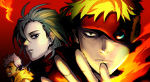
LESSA - The Crimson Knight
| Alt Names: |  레사 - 진홍의 기사 레사 시즌 2 LESSA Season 2 Лесса - Багровый Рыцарь 레사 - 진홍의 기사 레사 시즌 2 LESSA Season 2 Лесса - Багровый Рыцарь |
| Author: | Pogo |
| Artist: | Pogo |
| Genres: |  Action Adventure Comedy Drama Fantasy Mystery Seinen Supernatural Tragedy Webtoon Action Adventure Comedy Drama Fantasy Mystery Seinen Supernatural Tragedy Webtoon |
| Type: | Manhwa (Korean) |
| Status: | Complete |
| Description: | A year has passed since the Demans took over the island. The humans await a savior. A tale of a crimson knight that appears before them. Prequel (Season 1): > LESSA ( http://www.batoto.net/comic/_/comics/lessa-r5917 or http://www.webtoons.com/episodeList?titleNo=89) Original Webtoon from Naver: http://comic.naver.com/webtoon/list.nhn?titleId=603159 |
| Go to LESSA - The Crimson Knight Forums! | Scroll Down to Comments | |


Latest Forum Posts
| Topic | Started By | Stats | Last Post Info | |
|---|---|---|---|---|
 |
[Epilogue up] lessa crimson knight translations  |
bahboh |
|
|
|
Crimson Knight chapter discussion |
truepurple |
|
|

 Start New Topic
 Highest Rated Series


498 Comments
someone, just love him forever please.
Also previously OGE tl'd raynald's fighting name as Mr. Pogo, and I, without thinking, went along with that in ch 69, but after seeing it in Korean again in this ch and remembering Raynald's last name, Berger. I think Mr. Berger as his fighting name is more appropriate.
Yes! We finally get to see the rest of what happened after
We still need to eventually see Diane's side of the events. For bad or for good, she must have had reasons that lead her to what she did. It's hard to believe that Rano in a past life would do such a thing without one...
Speaking of which, I wonder what the significance/meaning of that last panel was?
I didn't get it. What is it about the wig?
Agreed. I had to skim the prelude chapters from season 1 to understand what was being said in this chapter. This chapter makes a lot of references to previous parts of the story.
whaaat >.<
i guess i'll have to reread to understand what's all going on
every time this ch mentioned the frozen heart i kept thinking
Oh man, so that's the story behind the wig ))
))
thanks for translating!!! : )
ohhhh so lessa is gonna kill ares?
but i doubt that as well....
No, I really don't like his new look. I think I would have prefered the "hair of shame".
On another topic, I'm kind of sad for Lessa. He is not the vessel he used to be so.. I wonder If the author will play with that in the future.
props to darkStephanie and shijon
The author has an interesting spelling as 'Raynald Berger'
"cute little horns" ha...
Not into his new look, he should've been better drawn
i just jizzed my pants
Rano, HOLY SHIT!!

That was awesome!
Thanks for the translation!
Woah shit Rano. You look awful.
Oh man, hold on to your socks. ch 68 is going to be a fun fight. lots of wtf-ing demans :3
thanks for your translating.
Whoa.
White, I was not expecting that.
For those of you who can't remember who Caleb is, he was introduced way back in Season 1. You can read some of it on "Line Webtoons", legally.
Tbh I never cared too much for that dude with bowl hairdo. Now I feel like the chapter was too short because I didn't care about that.
In fact, does somebody remember the guy who owned the dogs from somewhere else? Because If he was only introduced now just to be killed off and show us "bowl-head's-penthahorns" then the more reason to find most of the chapter everything but memorable.
I did like the design of the bowl-dude tho.
(Up front disclaimer: I am not someone who deals with fonts much, though I am surrounded by people who do)
For better or for worse, (English-speaking) people will get upset when Arial, etc. is used in most comics. It's probably as much a matter of what we're accustomed to as anything, but it's incredibly distracting.
Possible reasons for this include:
1. Arial and its kin are used everywhere for mundane things, and they are the default font in many programs. Because of that, newcomers in many trades tend to reach for them first, so we associate the fonts with badly-done work that we've seen before.
2. This may be essentially a result of the above, but they are currently unfashionable in graphic design, so they don't get used much in pretty things. This has helped add to their reputation of being essentially "practical but ugly".
3. The end result of this is, really, it's somehow hard to imagine a "voice" when reading a short sentence in one of these fonts. In this context. I suspect it's just conditioning, but there you have it.
If you want to have a similar style to the original, use a font that doesnt have different capital and lower case letters, like them.
But I dont understand what you want with similarity, korean letters are completely different. Always consider whats the most pleasing to the eyes, whats easy to read. Now the letters are too narrow and tall, making them hard to read.
The hotlink failed, next time just upload the images to an image sharing site like imgur.com.
And finally, just for the future reference, never use vertical text, thats a horrible crime.
Thanks for the chapter ... no one is born a master.
Here is a tutorial from Red Hawk Scanlations about typesetting: http://www.redhawkscans.com/showthread.php?3308-Typesetting-introduction
There you also can find more Scanlator Tutorials: http://www.redhawkscans.com/forumdisplay.php?44-Scanlator-Tutorials
You also could try to contact Operation gstörte Esel maybe you can help them or the can help you with the fonts or maybe the have a download script for the chapters ....