
 Sign In
 Create Account
Rocki-dono, as I say in the first post any render/image is welcome, but if they don't offer any is for the gfx-er to select the ones he desire. Even though, is completely neccessary a theme for the sign, is not for the gfx-er to do a sign of his own tastes for this is a "personal" signature.
Yet, from now on, as rocki-dono mentioned, please offer the images thou desire if thou can, renders art most welcome.

Signature Workshop
Started by yumeshi, Dec 05 2011 03:39 AM
#41

 Posted 09 December 2011 - 08:05 PM
yumeshi
-

- Members
-

- 92 posts
Fingerling Potato
- LocationMy subconscious
 Back to top
#42
Posted 09 December 2011 - 08:31 PM
Haganai
-
- Members
-
- 92 posts
Fingerling Potato
- LocationBatoto
Here are something you guys can use
Renders:
http://www.animerender.com/
http://planetrenders.net/
http://sakurahana.com/forum/studio-gallery/
http://forum.nihonomaru.com/misc-case/
and fonts if you have needs for it
http://www.dafont.com/
Renders:
http://www.animerender.com/
http://planetrenders.net/
http://sakurahana.com/forum/studio-gallery/
http://forum.nihonomaru.com/misc-case/
and fonts if you have needs for it
http://www.dafont.com/

#43
Posted 09 December 2011 - 11:23 PM
yumeshi
-
- Members
-
- 92 posts
Fingerling Potato
- LocationMy subconscious
Thanks Haganai-dono, i will put them in the first post for the future petitioners.
Here thou have:
URL: http://img696.images...6/firmacudi.png
I think i got the font thing better at this one, could anyone please tell me?
ps: if thou don't want the "beck" at the corner (is an image text) please tell me and i will take it out, but i think it fit there all right.
Wow, you guys are pretty talented, not to mention awesome for doing something like this
If you have the time, I would like to request a signature.
I would like Koyuki from Beck: Mongolian Chop Squad (maybe the whole band if you can : P)
Thank you so much!~ would really be awesome : >
Here thou have:
Spoiler

URL: http://img696.images...6/firmacudi.png
I think i got the font thing better at this one, could anyone please tell me?
ps: if thou don't want the "beck" at the corner (is an image text) please tell me and i will take it out, but i think it fit there all right.
Edited by yumeshi, 09 December 2011 - 11:24 PM.

He who strikes the first blow admits he's lost the argument.
#44
Posted 09 December 2011 - 11:41 PM
Haganai
-
- Members
-
- 92 posts
Fingerling Potato
- LocationBatoto
Your welcome
..umm i don't know much about graphic
stuff like depth, focal point or whatever people are talking about on every gfx sites, i just don't get it..to much hassle to try focus on it...
so i just did what i want, ..so i cant comment on the font
But it looks good, blended in well the the bg!
..umm i don't know much about graphic
stuff like depth, focal point or whatever people are talking about on every gfx sites, i just don't get it..to much hassle to try focus on it...
so i just did what i want, ..so i cant comment on the font
But it looks good, blended in well the the bg!
#45
Posted 10 December 2011 - 12:04 AM
ALL HAIL TREBOR
-

- Banned
-

- 157 posts
Unloved Potato
- LocationUSA
Thank you!
It means a lot, and I do like the text
(Happy CuDi)
It means a lot, and I do like the text
(Happy CuDi)
I decided to impersonate an admin, and all I got was this lousy gimped account. 
I'm also banned because I'm a sockpuppet of Kurt/POMF
I'm also banned because I'm a sockpuppet of Kurt/POMF
#46
Posted 10 December 2011 - 09:34 AM
bumblebee310
-
- Members
-
- 189 posts
Potato
Im a bit confused bumblebee-dono, thou wanted the 2/3 of the max width allowed, so 400px and the 2/3 of the default height, so 100px, but isnt that signature size strange? i tried doing it, but then again, thou wanted to have JEWEL alone or JEWEL and below BUMBLEBEE? i made both versions just in case.
With bumblebeeSpoiler
URL: http://img85.imagesh.../firmajewel.png
Without bumblebeeSpoiler
URL: http://img833.images...firmajewel2.png
Im not really used to this sign size, but did the best i could, please tell me if this was what thou desired.


UWAAAAA... it looks so coooool.. imma change my sig now!
yep yep, this was my heart's desire ^^
THANK YOU!
(and sorry too for the confusing request. gomen!)
---------- In vain have I struggled. It will not do. My feelings will not be repressed. You must allow me to tell you how ardently I admire and love you. ----------
#47
Posted 10 December 2011 - 11:31 AM
WickedEly Liencourt
-

- Members
-
- 181 posts
Potato
- LocationWorld of Derp
Here thou have, Ely-dono.
Spoiler
URL: http://img585.images...18/firmaely.png
I hope thou like it, though i still think the one thou wear is better. And looks like i just can't improve my fonts, im not sure how i should use 'em.

Thank you my dear yumeshi...
You really are a cool Oppa!!! *hugs*


Spoiler
#48
Posted 12 December 2011 - 04:16 AM
bumblebee310
-
- Members
-
- 189 posts
Potato
Hello, yumeshi-san!
I stumbled upon a badass font that would make the sig a whole level awesome.. Could I edit the sig and use the font? =)
I stumbled upon a badass font that would make the sig a whole level awesome.. Could I edit the sig and use the font? =)
---------- In vain have I struggled. It will not do. My feelings will not be repressed. You must allow me to tell you how ardently I admire and love you. ----------
#49
Posted 12 December 2011 - 07:16 AM
SquatRarityDeadliftTruck
-

- Members
-
- 30 posts
Potato Spud
Will be done in a few min..
Here you go: (with and without border)Spoiler


THANKS DUDE THIS CANNOT GET ANYMORE MANLY, THIS LITERALLY KINDA SORTA PERFECT (see:below)
ALTHOUGH WTF IS THAT BLOCK S**T???
JUST WONDERING, PRETTY F***ING WUNDERBAR JOB
Trollmodeoff- Although I was expecting less (see:no) pink because pink happens to be Pinkie Pie's color and I HATE PINKIE PIE SHE IS A WHORE WHO LETS ANYONE MOUNT HER. LOLOLOL TROLLMODE NEVEROFF
Ok srs- Although I think you did a great job, especially for no payment of any kind, it was not what I was expecting. I was expecting a Script font (just in case, see: Cursive). Also, you did some sort of fade effect on the portrait so that the original colors are darker and duller. Your end result was not what I was expecting, but you did a good job and for free too. I will be using this sig pic unless I can get one that I feel is better.
TL;DR - I appreciate your efforts and will be using your sig, but you didn't really fufill the major requirements : original colors for the portrait(Rarity is way darker/duller, while the rest is bright?), the graphic is not particularly minimalistic in design, the font isn't in script, and the leaves catch the eye much more than anything else in the sig (other than the name ofc).
Once again, thanks for doing this thankless task, and I will thankfully use this until I can get one that is more fitting to my criteria. Do not take my criticism the wrong way.
ONCE AGAIN SO I DON'T SOUND UNGRATEFUL, THANKS FOR THIS, BUT IT DIDN'T RWALLY FIT WHAT I WANTED, I WILL USE THIS WHEN NOT ON MY IPOD AND WHEN I GET A BETTER ONE I WILL SWITCH. NO HARD FEELINGS AND DO NOT CRY WHEN YOU READ THIS. I AM SORRY TO INFORM YOU OF THIS GRAVE NEWS, I'M SURE THAT THIS NEWS BREAKS YOUR HEART,MBUT DON'T FRET I AM BUT ONE UNIMPORTANT PONY IN A SEA OF FISH, THERE IS SI MUCH MORE OUT THERE, DON'T WORRY, YOU'LL GET OVER THIS CHAMP.
Way too long;didn't read the post - Thanks bro, ILY (I love you) <<<3333 I give you £2 for a job done bien.
Edited by Rarity, 12 December 2011 - 07:28 AM.
Spoiler
#50
Posted 12 December 2011 - 09:04 AM
Haganai
-
- Members
-
- 92 posts
Fingerling Potato
- LocationBatoto
Actually i didn't like it at all to, the block are your name with some weird font, and thats how it look like, didn't bother to change, sorry, when i have time i'll remake it.
it was kind of a rush job on my part, and the pic was kind of hard to re-made into a sig, for me, because i've just started back after 4 month of quitting lol-
and those kind of pics don't sit well with me
Also thanks for the feedback lol
it was kind of a rush job on my part, and the pic was kind of hard to re-made into a sig, for me, because i've just started back after 4 month of quitting lol-
and those kind of pics don't sit well with me
Also thanks for the feedback lol
#51
Posted 15 December 2011 - 03:48 AM
SquatRarityDeadliftTruck
-
- Members
-
- 30 posts
Potato Spud
Actually i didn't like it at all to, the block are your name with some weird font, and thats how it look like, didn't bother to change, sorry, when i have time i'll remake it.
it was kind of a rush job on my part, and the pic was kind of hard to re-made into a sig, for me, because i've just started back after 4 month of quitting lol-
and those kind of pics don't sit well with me
Also thanks for the feedback lol
Thank you kindly. I'll use both, after all, I'm not an ungrateful little shyt
Spoiler
#52
Posted 19 December 2011 - 11:42 AM
The Roady
-

- Members
-
- 262 posts
Russet Potato
- LocationElder of Past Times


#53
Posted 19 December 2011 - 04:55 PM
yumeshi
-
- Members
-
- 92 posts
Fingerling Potato
- LocationMy subconscious
Well... i'm not sure if thou were making a petition or not Neo-dono, next time try to be more specific or at least write the necessary info i put in the first page.
can we do something with this?
Spoiler

URL: http://img14.imageshack.us/img14/521/firmaneoruto2.png
Is not the best image for my stile, but i tried what i could. Hope thou like it.
Edited by yumeshi, 19 December 2011 - 08:30 PM.
He who strikes the first blow admits he's lost the argument.
#54
Posted 19 December 2011 - 08:35 PM
The Roady
-
- Members
-
- 262 posts
Russet Potato
- LocationElder of Past Times
#55
Posted 28 December 2011 - 09:54 PM
Over9000Wombats
-
- Members
-
- 44 posts
Potato Spud
- LocationDestroying a city near you
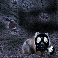
Um, would it be possible to have a sig with a wombat in it (or more) default size is good and I trust your artistic instinct. A quote (if you can fit it) would be
"I am so sand!", since I'm the one who said it I guess it doesn't need to be credited.
Thanks a bunch in advance!
"I am so sand!", since I'm the one who said it I guess it doesn't need to be credited.
Thanks a bunch in advance!

#56
Posted 29 December 2011 - 03:13 AM
yumeshi
-
- Members
-
- 92 posts
Fingerling Potato
- LocationMy subconscious
Um, would it be possible to have a sig with a wombat in it (or more) default size is good and I trust your artistic instinct. A quote (if you can fit it) would be "I am so sand!", since I'm the one who said it I guess it doesn't need to be credited. Thanks a bunch in advance!
Well that's an..... interesting petition... i did what i could, i hope thou like it.
Spoiler
URL: http://img27.imageshack.us/img27/2828/wombatsign.png
He who strikes the first blow admits he's lost the argument.
#57
Posted 29 December 2011 - 03:19 AM
Angelo.
-

- Members
-
- 3,488 posts
Couch Potato
- Locationsleeping on a cloud
yumeshi i dont have a sig!!!! create one of Allen walker please! make it to the best of your ability. just add my username for quote.
Edited by Rei-Sama, 29 December 2011 - 03:26 AM.
#58
Posted 29 December 2011 - 03:26 AM
Angelo.
-
- Members
-
- 3,488 posts
Couch Potato
- Locationsleeping on a cloud
nice.Well that's an..... interesting petition... i did what i could, i hope thou like it.
Spoiler
URL: http://img27.imagesh.../wombatsign.png
#59
Posted 29 December 2011 - 03:29 AM
Over9000Wombats
-
- Members
-
- 44 posts
Potato Spud
- LocationDestroying a city near you
It's amazingWell that's an..... interesting petition... i did what i could, i hope thou like it.
Spoiler
URL: http://img27.imagesh.../wombatsign.png
 I am so happy right now!
#60
Posted 29 December 2011 - 03:41 AM
Buttock Follicle
-

- Contributor
-

- 2,433 posts
Couch Potato
- Locationfuttocking away~
Well that's an..... interesting petition... i did what i could, i hope thou like it.
Spoiler
URL: http://img27.imageshack.us/img27/2828/wombatsign.png
It looks very alvin and the chipmunks xD


